2024 · SaaS landing page
AI Agency Website Redesign
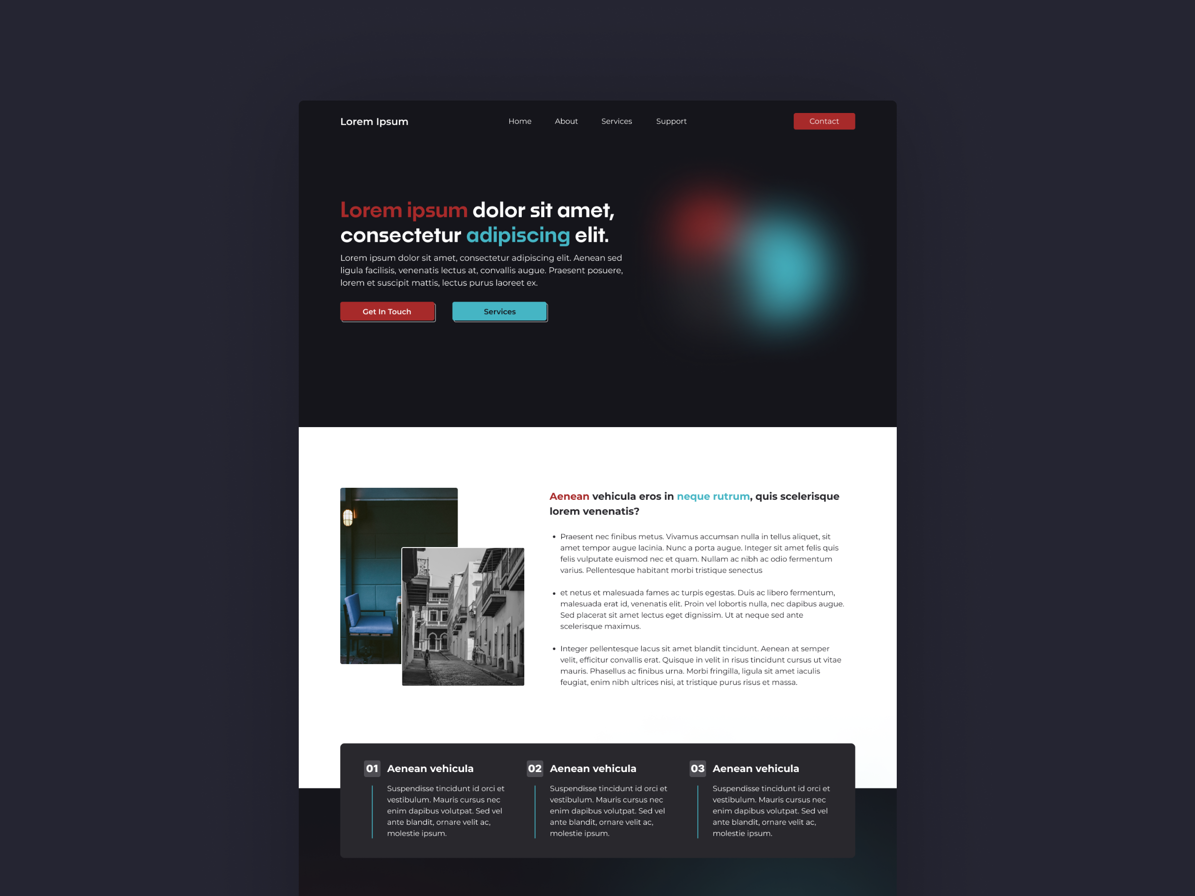
A concept landing page for a fictional AI agency, exploring how soft gradient lighting and editorial typography can ground an otherwise futuristic category.
- Client
- An AI agency (concept)
- Role
- Design & Frontend
- Year
- 2024
- Type
- SaaS landing page
A self-initiated concept landing page for a fictional AI consulting agency - built to push back against the “neon grid, glowing robot” cliché and prove how minimal a category-leading page can be while still feeling premium.
Context
Most AI agency sites felt interchangeable: dark mode, gradients, abstract 3D blobs, copy that could belong to any vendor. Treating this as a concept - no client, no stakeholders - let me make opinionated calls and ship them. The Dribbble shot was the starting point; the build was the proving ground.
Problem
The hard part of an AI landing page is hierarchy. There is usually too much to say - services, case studies, differentiators, contact - and not enough proof to back any of it up. A first-time visitor needs to understand the offer in roughly two seconds, then decide whether to keep scrolling. I needed a structure that compressed the pitch into a single readable line and let secondary content load in below the fold without competing with the hero.
Approach
I locked the palette to a deep navy background with one warm-red and one cyan accent, reused in the headline color shifts and the two primary buttons.
The page only ever asks the eye to track two hues.
The hero headline uses a large serif-toned sans with mixed weight and color to do the work a stock photo would normally do. Below the fold I switched to a clean white panel for the services section to break the dark monotony, then closed on a dark card row with numbered service tiles - echoing the hero palette so the composition feels circular.
Outcome
The shot was published on Dribbble and the built version lives in my portfolio as a working static page. As a concept piece I’m not claiming traffic numbers - the deliverable was the artifact and what I learned making it. What I got was a reusable layout system: the dark-light-dark rhythm, the two-accent discipline, and the numbered-tile footer have all shown up in later client work.