2024 · SaaS landing page
MC Hosting Company
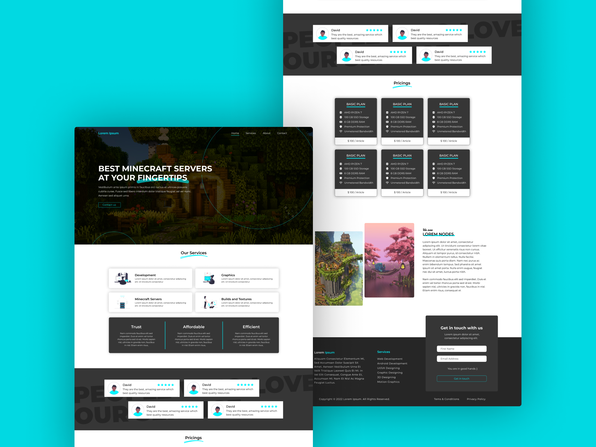
A concept landing page for a Minecraft server host, pairing a dark gamer-friendly palette with a clean SaaS pricing layout.
- Client
- A Minecraft server hosting company (concept)
- Role
- Design & Frontend
- Year
- 2024
- Type
- SaaS landing page
A concept landing page for a fictional Minecraft server host - an experiment in merging the moody, blocky world of the game with the structured clarity of a modern SaaS site.
Context
Minecraft hosting sites tend to either go full pixel-art and lose credibility, or full corporate SaaS and lose the audience. I treated this as a portfolio exercise to find the middle: enough gaming texture to feel native to the community, enough structure to feel trustworthy for a parent buying a server for their kid. The brief was a single-page marketing site - hero, services, pricing, social proof, lead form - all sharing one cohesive system.
Problem
The core challenge was tonal. A Minecraft screenshot is visually noisy - greens, browns, torchlight - which fights with any UI placed on top of it. A pricing grid, meanwhile, needs calm space to be readable. Lean too hard into the game and the pricing feels like a billboard in a forest; lean too far into SaaS minimalism and the hero feels disconnected from the product.
Approach
I split the page into two visual zones. The hero uses a dark overlay on the gameplay image with a single cyan accent for the CTA, echoed later in star ratings and underlines. Everything below switches to a near-white background with charcoal cards, so the pricing tiers and service icons sit on calm ground.
A layout that reads as a real product page first and a gaming site second.
The pricing block uses a three-by-two grid of dark cards with checklist features, balanced against lighter testimonial cards above. A faint outlined wordmark runs vertically down the side as a quiet branding moment.
Outcome
The hero carries the personality while the body does the selling. The cyan accent gives me a consistent way to mark interactive elements without repainting the whole page. As a concept piece it lives on Dribbble, but the component structure - hero with overlay, icon-led services row, dark pricing grid, testimonial strip, footer with inline form - is something I’ve since reused as a starting point for other SaaS briefs.