2024 · SaaS landing page
Photographer Portfolio
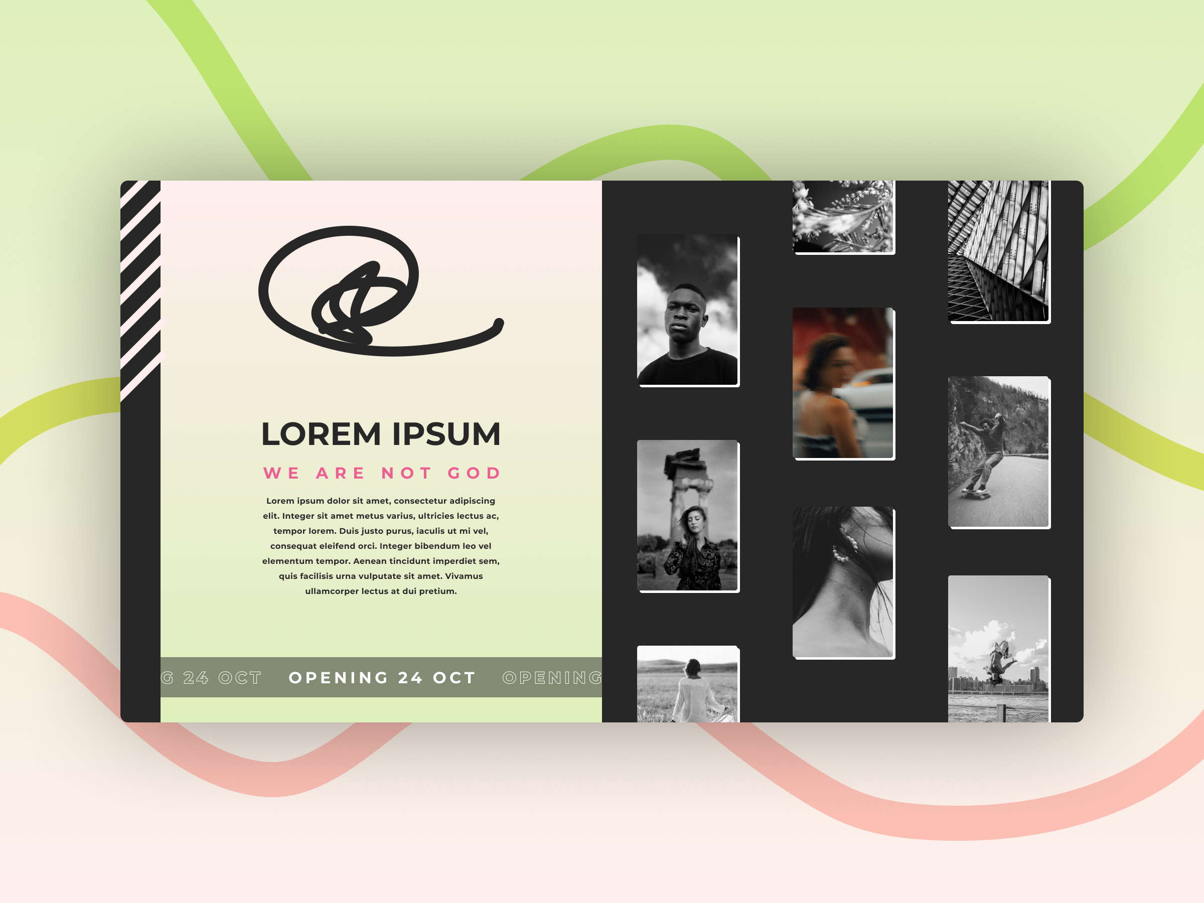
An opening-soon page for a portrait photographer pairing a soft editorial layout with a moody contact-sheet grid to tease the full portfolio.
- Client
- Concept piece for an emerging portrait photographer
- Role
- Design & Frontend
- Year
- 2024
- Type
- SaaS landing page
An “Opening 24 Oct” teaser for a fictional portrait photographer - treating a launch page as the first frame of a body of work rather than a placeholder full of countdown timers.
Context
I wanted to push back on the default “coming soon” template - the centred logo on a dark gradient with an email field underneath. Photographers live or die by sequencing, so the brief was to design an opening shot that already feels curated. Visually I leaned on editorial print references: asymmetric grids, generous serif type, a coral accent borrowed from darkroom safelight, and pastel ribbon shapes to soften the hard rectangle of the card.
Problem
Teaser pages have a thin job description and a wide failure mode. Say too little and visitors bounce; say too much and you spoil the launch. The harder constraint is tonal - the page has to introduce a personal aesthetic in one screen without showing the actual portfolio. The contact-sheet grid had to read as intentional curation, not stock filler, which meant the typography had to do most of the emotional work while the imagery stayed deliberately monochrome.
Approach
I built the page around a single card floating on a pastel field, which keeps focus and lets the background ribbons breathe. The left column carries identity - mark, name, tagline, paragraph - while the right is a four-by-two greyscale portrait grid so nothing competes with the coral accent.
A launch page that behaves more like a magazine cover than a holding screen.
The “OPENING 24 OCT” marquee runs along the card’s lower edge as a quiet animation cue. In code I prototyped it with Next.js and Tailwind, using Framer Motion for the marquee loop and a gentle parallax on the ribbon shapes.
Outcome
The greyscale grid sets expectations for the photographer’s range, while the coral manifesto line gives the brand a point of view before a single full image loads. As a portfolio exercise it gave me a reusable pattern for any creative who needs an interim site - a card-on-canvas layout that scales from teaser to full landing page just by swapping the right-hand grid for live content.