2024 · SaaS landing page
Restaurant Website Redesign
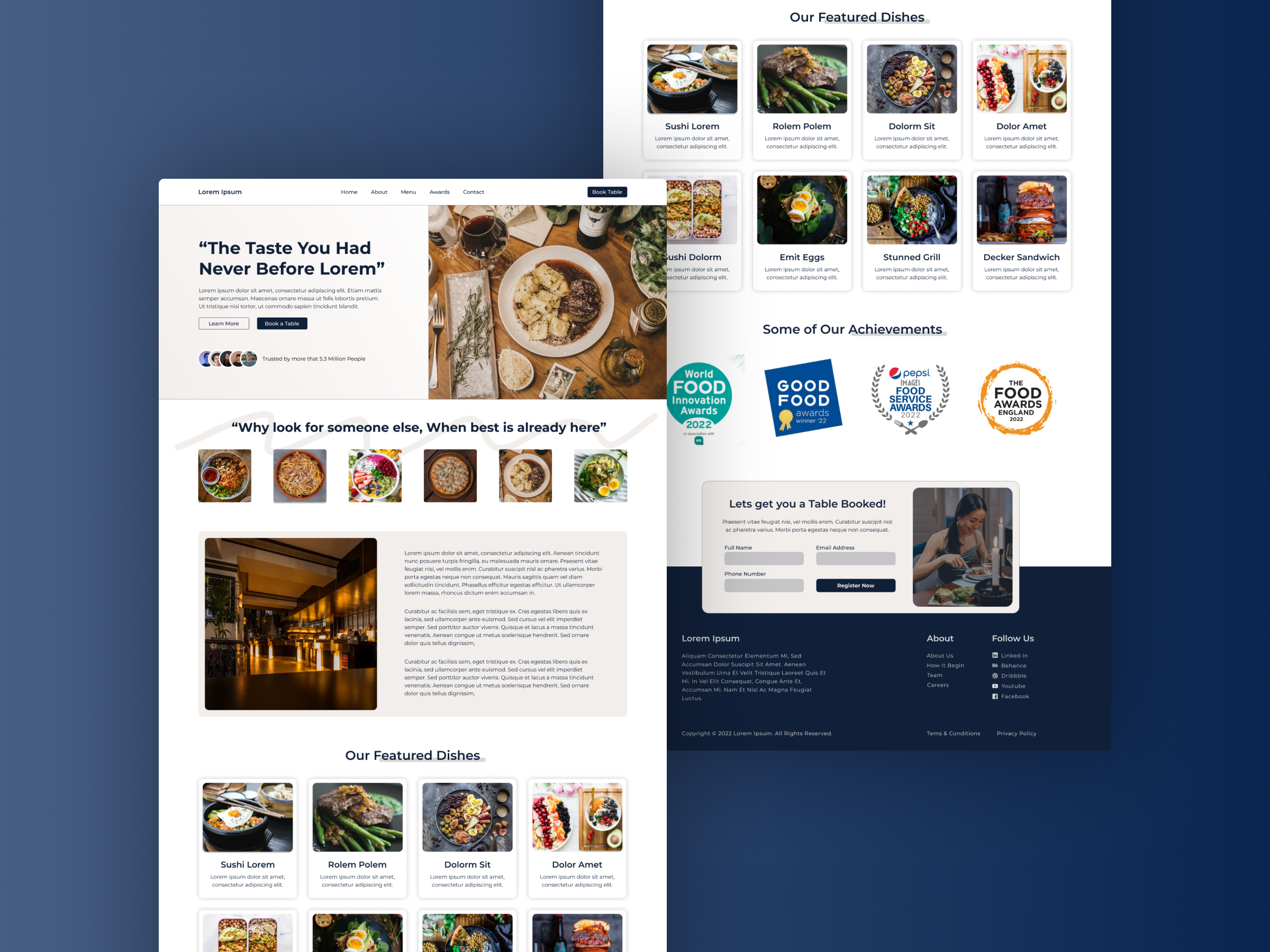
A concept landing page for a fine dining restaurant, leaning on appetite-driven photography, warm editorial typography, and a calm navy palette.
- Client
- Concept project - fictional fine dining brand 'Gourmet Haven'
- Role
- Design & Frontend
- Year
- 2024
- Type
- SaaS landing page
A concept for “Gourmet Haven,” a fictional fine-dining brand - practice in marketing layouts that lead with photography rather than copy, closer to a food magazine spread than a booking funnel.
Context
Most restaurant sites were either overbuilt CMS templates or skeuomorphic chalkboard themes. I wanted to see what a quieter, more editorial direction looked like. I treated it as a self-directed exercise: invent a brand with a clear personality - warm, considered, slightly upscale - then design a single landing page that could plausibly sit alongside a real reservation flow.
Problem
A restaurant landing has to do two contradictory things in one screen: make you hungry and make you book. Lean too hard on imagery and the conversion path disappears; lean too hard on the booking widget and it feels like an airline site. The page also needed to feel handmade rather than templated - most reference sites used the same three stock layouts, and I wanted to avoid that.
Approach
I started in Figma with a moodboard of food magazines and worked outward from the hero plate. The headline uses a serif at near-display size; the body settles into a clean sans for legibility. Circular dish thumbnails in the cuisine selector break up the rectangular rhythm of the cards below.
Everything sits on a single navy canvas so the cards float like printed menu pages.
The awards row uses three real-looking badges centred against white to act as a trust break before the reservation card - kept calm, not loud, since the rest of the page already does the selling.
Outcome
The deliverable was the landing comp plus a short component inventory I could reuse on future hospitality concepts - card, badge row, circular selector, reservation form. It performed well on Dribbble, and a couple of recruiters referenced it, which told me the editorial direction was reading the way I intended. I’ve since pulled the dish-grid pattern into two later concepts without rebuilding it.