2024 · SaaS landing page
Freelance Service Team
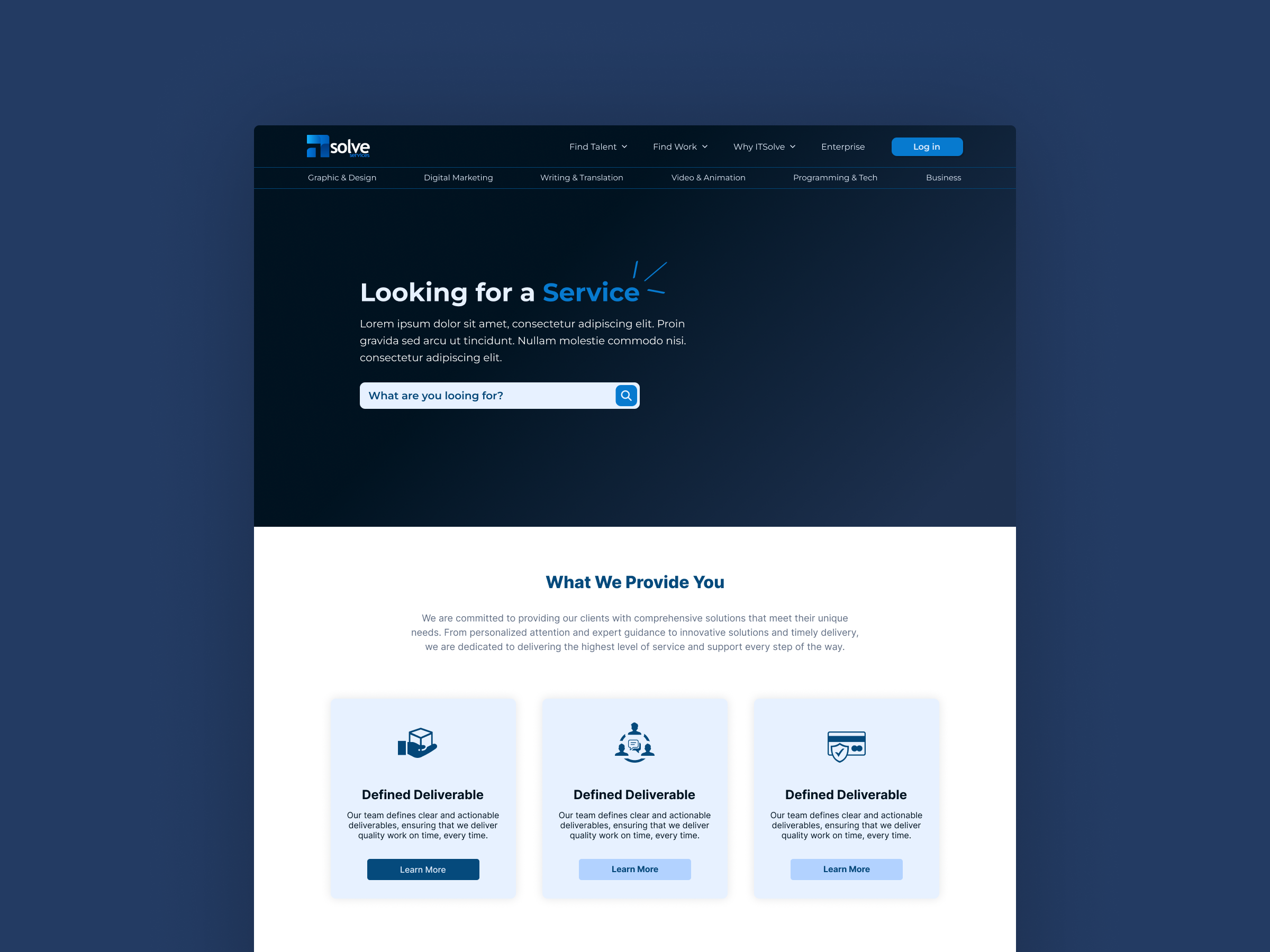
A concept landing page for a freelance services marketplace, pairing a deep navy hero with a soft, card-led offering grid.
- Client
- A freelance services marketplace (concept)
- Role
- Design & Frontend
- Year
- 2024
- Type
- SaaS landing page
A landing-page concept for “iSolve” - an imagined marketplace for hiring freelance service teams - designed to read as a calm, trustworthy entry point rather than a noisy directory.
Context
Most freelance marketplaces felt visually cluttered: dense grids, screaming CTAs, busy illustrations. I wanted the opposite. The brief I gave myself was simple - a single search-led hero, a category nav that doubles as discovery, and a short “what we provide” strip that explains the value before the user commits to a query. It was also a chance to practice a constrained two-tone palette, where almost all the personality comes from typography and spacing.
Problem
A marketplace homepage has to do two contradictory jobs at once: show breadth and reduce overwhelm. Stack the categories too prominently and the page looks like a directory; hide them and users don’t trust the inventory. The hero copy and the search field compete for the same focal point, and the value-prop section underneath has to reassure without repeating the hero. Resolving those tensions inside one above-the-fold view was the core problem.
Approach
I split the page into two clear moods. The hero uses a saturated navy with the cyan accent reserved only for the active word and the primary button.
The eye is pulled to the search bar by contrast alone.
The category nav sits as a slim secondary bar - present but quiet. Below the fold, the palette inverts to white with pale-blue cards for the “Defined Deliverable” trio, using identical card structures to signal the offerings are comparable. Generous vertical rhythm and a single sans-serif family keep the hierarchy doing the heavy lifting.
Outcome
The final shot reads exactly as intended: the eye lands on the headline, drops to the search input, then scans the category bar as a quiet backup. The lower section feels like a different surface entirely, which gives the page a sense of pacing taller marketplaces usually lose. I shipped it on Dribbble and reused the hero pattern when prototyping search-led layouts for later client work.